
Visualising Yield Curves
Bond maths, US Treasuries, and yield curves in Python

Another bond related piece this week. I can only hope that readers will indulge me, although I maintain that the bond market is a monumental human endeavour that it is worth our consideration.

Do not be misled by the unassuming appearance of a yield curve. Its anodyne slope is but a deceit.
In one sweep, a yield curve charts the present and the future, testament to incomprehensibly vast market forces. With a mere line, it quantifies economic expectations, seething currents of geopolitics, and the capricious fervour of collective human behaviour.
As it ebbs and flows, the yield curve manifests the sentiment of countless market participants, each playing the all-consuming game of risk and reward through a ceaseless exchange of debt securities. In doing so, it helps reveal the shape of our world.
Today, I want to share some thoughts on collecting and visualising yield curves for US Treasury securities in 2-dimensional and 3-dimensional charts using open-source data.
I shall not assume any prior knowledge. Therefore, I shall begin with an elementary overview of bond maths and the US Treasury markets.
Disclaimer: All content is exclusively my own opinion. As such, nothing presented here should be construed as investment advice, nor do the opinions expressed here reflect the views of my employer. The information presented here is intended solely for your entertainment and educational purposes.
Quick Bond Maths
Bonds are a type of debt packaged up in the form of financial assets (‘securities’).
Bond markets enable entities that need capital (long-term financing) to access public marketplaces. In these marketplaces, bond issuers (borrowers/debtors) raise the capital they need from other market participants (creditors) by selling their bonds in exchange for cash.
In general, for the privilege of borrowing money through bond issuance, the issuer of the bond must perform contractual obligations. Invariably, these obligations include (i) providing a cash flow to the bondholders (the creditors) in the form of interest payments (coupons) paid over a specified time-frame, and (ii) re-paying the original sum borrowed (the principal or par amount) at the bond’s maturity date (a final re-payment date sometime in the future).
Together, the coupons and the principal generate a rate of return that is known as a yield. The yield can be measured in many different ways - a whole other discussion that merits its own separate post.
For most financial assets, yields are directly proportional to price. For instance, the rate of return on the capital stock (the shares) of a publicly-listed company rises as its price rises. By contrast, bond prices and yields have an inverse relationship. In other words, the yield of a publicly traded corporate bond goes lower when its price rises, and rises when its price falls.
So, for example, if an investor holds a bond whose yield increases, the value or price of that bond investment actually decreases - if you were to sell it back into the market, you would get a lower price for it.
This is a matter of perspective. With the stock, the yield or rate of return is measuring what an investor has already earned, whereas, with bonds, the yield is calculating what an investors would in future earn. This difference in perspective is a result of the different maturity profiles of the respective securities: an equity is a perpetual instrument, whereas a debt security is usually time-bound (e.g. 10-years).

A bond’s price-yield relationship can be plotted on a graph as follows:

This chart does not quite tell the full truth. In reality, most bonds actually display convexity, curvature towards the origin, since the degree to which the price of a bond will change in response to changes in underlying interest rates is not perfectly linear.
Setting convexity to one side, below, we can use Python’s in-built random function to generate hypothetical values to demonstrate how a linear bond price-yield relationship looks over a simulated time series:

Yield Curves
A yield curve is a graphical representation plotting the relationship between the yields for a set of bonds (on the vertical y-axis) and the maturity dates of the same set of bonds (on the horizontal x-axis).
A yield curve is typically plotted for bonds which have a degree of comparability, for instance, bonds that have similar credit qualities (e.g. European bank bonds that are all rated ‘BBB’) or that have been issued by the same entity (e.g. bonds that are all issued by the Italian Government).

When plotted on a chart, investors often seek to classify the appearance of the yield curve in three ways:

‘Normal’ yield curve: When yield curves slope upward from left to right, that indicates that long-term bonds have higher yields than short-term bonds. This type of yield curve is termed ‘normal’ by investors because in a world where the time value of money holds, investors typically demand a higher yield to compensate for the longer time they must wait to receive their principal back.

‘Inverted’ yield curve: Occasionally, a yield curve slopes downward from left to right, indicating that short-term bonds have higher yields than long-term bonds. This type of yield curve is termed ‘inverted’ and is unusual. It usually suggests that the market expects interest rates (the price of time and uncertainty) to fall in the future. Certain types of yield curve inversion are also considered leading recessionary signals, such as the inversion of the the 10-year and 3-month US Treasury yields.
‘Flat’ yield curve: A yield curve that is relatively flat indicates that there is not much difference in yields between short-term and long-term bonds. This usually suggests that investors do not expect much change in interest rates in the foreseeable future.
US Treasury Market
Let’s focus now briefly on the specific subject of this piece, US Treasury bonds.
The US Treasury market is the largest market for a fixed income asset in the world (‘fixed income’ can be understood here as being synonymous with ‘debt’ and ‘bond’).
Weighing in at around the $20-25 trillion mark, the US Treasury market alone is roughly equivalent to 100% of US GDP, 50% of total US equity markets, or 20% of total global bond markets.
The US Treasury market is widely considered the backbone of the global financial system: the Treasury yield is the benchmark against which all other risk assets are measured; the Treasury yield curve serves as a key indicator of the health of the US and global economies; and Treasuries themselves are a store of value for corporates quasi-sovereigns, as well as foreign central banks:
The functionality of the system owes in large part to very broad-based global support and belief in the full faith and credit of the United States as applies to the Treasury bond market. So, it's not just its size, but it's liquidity, its depth and breadth of secondary markets and trading, and its availability to a very broad range of market participants.
Josh Younger, Macro Musings with David Beckworth
Visualising the US Yield Curve
Most frequently, the yield curve is visualised in one of two ways:
As a point in time

As a time series


Helpfully, the Federal Reserve Bank of St Louis, one of 12 United States Reserve Banks, publishes data in the public domain relating to a wide range of economic indicators including the US Treasury market.
This open-source data library is freely accessible to any user, including via an API that can be deployed in Python using a module known as FredPy.
I was interested in exploring whether there are more interactive and intuitive ways in which to manipulate and work with yield curve data. For the following visualisations, I have used data from the US Federal Reserve via the FredPy library API dating back to 1955.
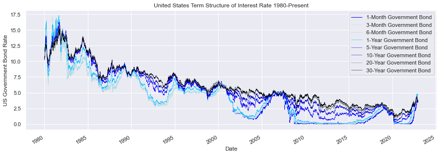
First, visualising the yield curve in 2 dimensions:

Here we see the long-term trends in US government bond yields. Driven up by inflationary pressures through the 1970s and early 1980s, yields begin declining following the ‘Volcker shock’. Focusing in on the second half of the chart, we can clearly see the structural decline in interest rates resulting in lower yields from 1980s through to the most recent era of unprecedentedly easy monetary policy up to 2022:
Next, using the same dataset but expanding the chart out into a third dimension, we can more clearly trace the term structure of the yield curve:

Focusing in again on the more recent data, from 2006-present, we are able to explore the undulations of the yield curve in far greater granularity. In particular, yield curve inversions come into clearer view:

For these latter chats, I have used the colormaps module of the MatPlot library in Python to highlight the variation in the data through a colour scale:
My 3-dimensional chart drew its inspiration from a stunning visualisation of the US yield curve, published in the New York Times by Gregor Aisch and Amanda Cox on 19th March 2015:

The same type of visualisation can now be accessed via the GC3D function on the Bloomberg terminal too:

How about visualising the yield curve as an overlaid time lapse series, with a colour scale to connote the time period:

Most brilliantly of all is this eccentric contribution from the Financial Times; Sonification: turning the yield curve into music (March 2019).
In this piece, the FT’s Alan Smith combines a daily animation of the yield curve with musical pitches to produce an altogether novel visualisation. The effect is that tiny daily oscillations in the curve become far more visible alongside more significant monthly and annual movement.
The animated version without sound is here (for sound please follow the link although subscription needed).

Bibliography
You can follow the GitHub links below to view my source code for the graphics in this piece: https://github.com/nicholasmaini/Bond-Yield-Curves
Bond Maths - Jupyter Notebook
Illustrative Yield Curves - Jupyter Notebook
Visualising the US Treasury Yield Curve - Jupyter Notebook
Dataset: US Treasury Yields from Federal Reserve Economic Data (via FredPy)
Python Documentation: Python Standard Library; Pandas; NumPy; MatPlotLib; Seaborn; SciPy; FredPy.
On yield curves
Financial Times, Yield Curve Explained, April 2022
Federal Reserve, The Yield Curve as a Leading Indicator
Podcast: Joshua Younger & David Beckworth, Macro Musings with David Beckworth, Joshua Younger on the Treasury Market: Structure, Stressors, and Potential Reforms
On 3D yield curve visualisation:
3D yield curve, New York Times, March 2015
Alexandre Ohayon, Canadian Yield Curve, Term Structure of Interest Rates a 3D Visualization
On animating the yield curve:
Brian C. Jenkins, Animated US Treasury Bond Yield Curve
Alan Smith, Sonification: turning the yield curve into music March 2019